

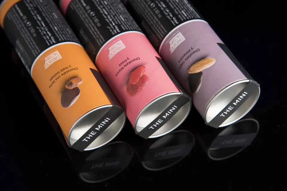
Colour is not purely decoration. It is also strategy, identity and differentiation. Did you know that colours directly influence how a product is perceived and the decision to buy? In the world of packaging, where every detail counts, the use of colour can turn a standard package into a powerful branding tool.
At Fatecsa, as manufacturers of cases, tubes and fully customised packaging solutions, we understand that colour design is not an extra but a decisive factor. Below, we explore how to work with colour in packaging effectively and professionally.
Colour psychology applied to packaging
Colour stirs emotions. And emotions, in many cases, steer our buying decisions. Blue can convey trust and technology. Green, sustainability and naturalness. Red, urgency or passion.
Applying these codes strategically in packaging design helps reinforce the product's values even before the customer opens it. It is a powerful way to connect with consumers on an unconscious level, and in a saturated visual environment this makes the difference.
Moreover, in a market where 70% of buying decisions are made in front of the shelf, colour becomes an essential ally.
For example, yellow evokes joy, energy and dynamism: it is ideal for youth products, snacks or seasonal items. Black conveys sophistication and exclusivity, which makes it perfect for premium lines or limited editions. White, associated with cleanliness and purity, is widely used in the pharmaceutical and cosmetics sectors. Earth tones, on the other hand, generate trust and closeness, which is key for brands that want to connect through authenticity or craftsmanship.
Colour can also define a positioning: pastel tones communicate delicacy; neons, modernity or irreverence. Even contrasts between colours can boost the visibility of the package on shelves and marketplaces, as long as they remain harmonious. Knowing how to combine these elements is part of the strategic work behind packaging. Laminates, prints, embossing or matt finishes can enhance the perception of colour and improve the user experience.
That said, although all of the above may give you a new point of view, it is important to maintain visual brand consistency. A package that does not respect the brand's colour palette loses recognition. In mass-market products, visual consistency is key to identification and loyalty.
As manufacturers of custom cases and tubes, we adapt every colour detail to the product, the message and the point of sale. We combine advanced manufacturing technology with personalised advice to achieve a unique result. You can get a quote on our website www.fatecsa.com